
Brand Management Blog & Resources
Think about the last time you recognized a brand without seeing its name. Maybe it was a specific shade of red on a soda can, a swoosh on a shoe, or a font on a billboard. That instant recognition is the work of a visual identity, and it is one of the most valuable assets a brand can own.
This guide explains what a visual identity is, the elements that make it up, how to create yours step by step, and the part most guides skip: how to keep it consistent when more than one person uses it.
What is a Visual Identity?
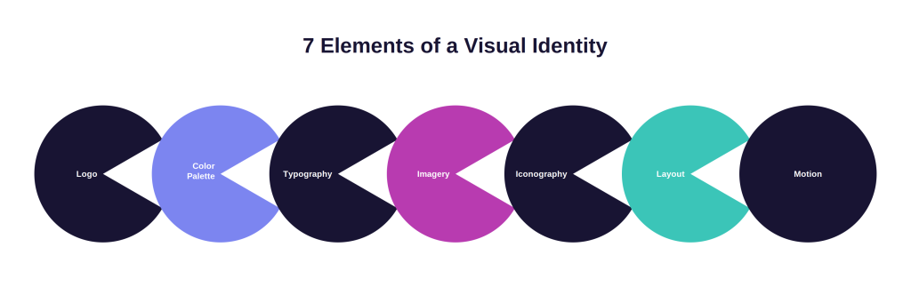
A visual identity is the collection of visual elements that represent a brand, including its logo, color palette, typography, imagery, iconography, and layout system. Together, these elements make a brand recognizable across every touchpoint, from a website hero image to a trade show booth to an email signature.
A visual identity does two jobs at once. It communicates who you are, expressing your brand’s personality, values, and positioning through design choices. And it builds recognition, so that over time your audience can identify your brand from a color, a shape, or a typeface alone.
The elements themselves are only half of a working visual identity. The other half is the set of rules that govern how those elements are used: which logo version to use on dark backgrounds, how much clear space to leave around it, which colors pair well, and what your photography should and should not look like. Design without rules produces inconsistency, and inconsistency erodes recognition.
Visual Identity vs Brand Identity: What is the Difference?
Visual identity is how your brand looks, while brand identity is the complete expression of your brand, including how it looks, sounds, and behaves.
Your brand identity includes:
- Visual identity: logo, colors, typography, imagery, graphics
- Verbal identity: brand voice, tone, messaging, taglines
- Brand strategy: mission, values, positioning, audience
A useful way to think about it: your brand identity is your brand’s full personality, and your visual identity is the face people recognize it by. Both need to stay consistent across every channel, and they should be documented in your brand guidelines so anyone creating content applies them consistently.
The 7 Key Elements of a Visual Identity
A complete visual identity is built from seven core elements, each of which needs both a design and a documented set of usage rules.
Logo
Your logo is the single most recognizable element of your visual identity. Most brands need more than one version: a primary logo, a simplified mark or icon, horizontal and stacked layouts, and light and dark variants.
What to document: every approved logo file in every format (SVG, PNG, EPS), minimum sizes, clear space rules, correct placements, and a set of misuse examples showing what never to do.
Color Palette
Brand colors trigger recognition faster than almost any other element. Research on color psychology consistently shows that color plays a major role in how quickly people identify a brand and what they feel about it.
What to document: primary and secondary colors with exact HEX, RGB, CMYK, and Pantone values, rules for when each color is used, approved color combinations, and accessibility contrast requirements for text.
Typography
Typography carries your brand’s tone in every headline and paragraph. A geometric sans serif reads modern and direct, a serif reads established and editorial, and the difference shapes how your message lands before anyone reads a word.
What to document: brand typefaces for print and digital, web-safe fallbacks, the type hierarchy (H1 through body and captions), weights, sizes, and line spacing.
Imagery and Photography
Your photography style tells people what world your brand lives in. Bright lifestyle shots, moody product photography, and flat illustration systems each communicate something different, and mixing them randomly dilutes your identity.
What to document: your photography style with real examples, approved image libraries, do and do not comparisons, and usage rights so teams never publish an image the brand cannot legally use.
Iconography and Illustration
Icons and illustrations extend your identity into product interfaces, presentations, and marketing materials. A consistent stroke weight, corner radius, and style make even small UI elements feel unmistakably yours.
What to document: the full approved icon library, style rules for creating new icons, and illustration guidelines covering style, color usage, and subject matter.
Layout and Composition
Layout is the invisible element of visual identity. Grid systems, spacing rules, and white space standards are why two brands can use similar colors and fonts yet look completely different.
What to document: grid structures for common formats, margin and padding standards, and template examples for your most-used asset types.
Motion and Interaction
For digital-first brands, motion is part of the identity. The speed of a transition, the easing of an animation, and the behavior of hover states all contribute to how your brand feels in use.
What to document: animation duration standards, easing curves, and examples of on-brand motion in context.
Your Visual Identity Deserves a Better Home Than a Folder
Brandy gives your logos, colors, fonts, and guidelines one organized, shareable home. One link replaces the “final_v3” folder, and everyone always sees the current version.
Free plan available. No credit card required.
Why Most Visual Identities Fall Apart
Most visual identities fail in daily use, not at the design stage. The rebrand launches, the agency delivers a beautiful brand book, and six months later, the sales team is still pasting a stretched logo from an old PowerPoint.
This happens for three predictable reasons:
Assets Are Scattered Across Tools
Logos live in a designer’s Dropbox, fonts in an email thread, and the brand book in a PDF nobody can find. When finding the right file takes longer than improvising, people improvise, and improvisation is where inconsistency begins.
Guidelines Live in Static PDFs
A PDF brand book is outdated the moment your brand evolves. Old versions keep circulating, teams reference different editions, and there is no way to know who is working from which rules. Guidelines only protect your identity when everyone is reading the same, current version.
Nobody Outside the Design Team is Enabled
Designers are a small fraction of the people who touch your brand every week. Sales builds decks, HR posts job ads, and partners create co-branded material. If those people cannot access approved assets and understand the rules without asking a designer, your visual identity is dependent on a bottleneck.
The fix for all three is the same: give your visual identity a single, central, always-current home that everyone can access. That is exactly the problem brand asset management platforms exist to solve, and it is why teams outgrow shared drives. If your assets currently live in folders, this breakdown of organizing brand assets beyond Google Drive shows where general-purpose storage falls short.
How to Create a Visual Identity in 6 Steps
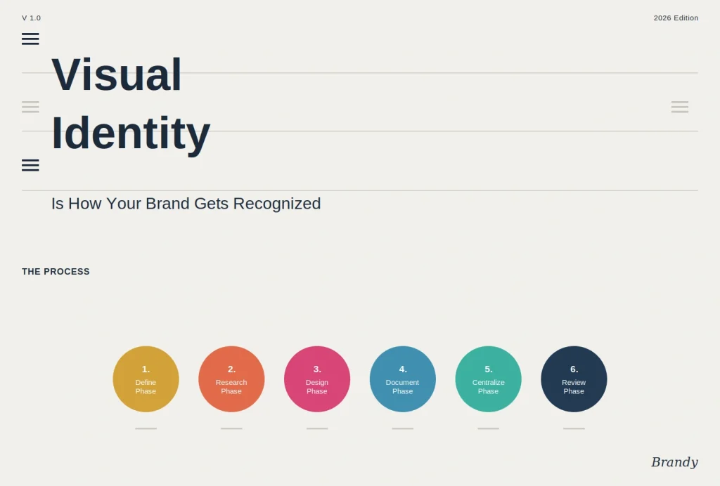
You can create a complete visual identity by defining your brand foundations, designing the core elements, documenting the rules, centralizing everything, enabling your team, and reviewing regularly. Here is how each step works.
Step 1: Define Your Brand Foundations
Every visual decision should trace back to strategy. Before any design work begins, get clear answers to four questions: What does your brand stand for? Who is your audience? What personality should your brand project? How do you want to be different from competitors?
Write these down. A design brief built on documented foundations produces work that fits your brand, while a brief built on vibes produces work that fits a trend.
Step 2: Study Your Competitive Landscape
Your visual identity has to be distinctive to do its job, and you cannot be distinctive without knowing what everyone else looks like. Collect the logos, palettes, and typography of your main competitors, then map where the category clusters. If every competitor uses blue and a geometric sans serif, that is your opportunity, not your template.
Step 3: Design the Core Elements
With foundations and landscape mapped, design the seven elements covered above, starting with logo, color, and typography, since those three drive the majority of recognition. Whether you work with an in-house team, a freelancer, or an agency, test every concept against two questions: Does this express who we are? Would we recognize it without our name attached?
Expect iteration. Strong identities usually take several rounds of refinement, and pressure-testing designs across real formats, a business card, a social post, an app icon, reveals weaknesses a presentation deck hides.
Step 4: Document the Rules
Design becomes a system only when the rules are written down. Create brand guidelines that cover every element: logo usage and misuse, exact color values, type hierarchy, imagery style, icon standards, and layout rules, each with real examples of correct and incorrect application.
Keep the guidelines practical. A 90-page brand book impresses in a rebrand announcement, but a clear, searchable guide that a new hire can apply in five minutes protects your brand better.
Step 5: Centralize Assets and Guidelines in One Place
Documentation only works if people can find it. Put your approved assets and your guidelines together in one central hub, so the person downloading the logo sees the rules for using it at the same time.
This is the step most brands skip, and it is the one that determines whether your identity survives contact with the rest of the organization. A brand hub like Brandy pairs every asset with its usage guidance and updates for everyone the moment anything changes, so the “which logo is current” question disappears entirely.
Step 6: Review and Evolve
A visual identity is maintained, not finished. Audit your live touchpoints quarterly, note where inconsistencies are creeping in, and treat repeated mistakes as a documentation problem rather than a people problem. When your brand evolves, update the guidelines first, because an undocumented change is just a new inconsistency.
4 Visual Identity Examples Worth Studying
The strongest visual identities share one trait: they are recognizable from a single element. Here is what four very different brands can teach you.
Coca-Cola: Ownership of a Color
Coca-Cola has used essentially the same red and Spencerian script for over a century. The lesson is discipline: recognition compounds when you resist the urge to redesign every few years and instead refine what already works.
Spotify: A System Built for Variation
Spotify’s duotone imagery, bold gradients, and consistent green mark let the brand look wildly creative campaign to campaign while staying instantly identifiable. The lesson: strict rules do not limit creativity; they make variation safe.
Mailchimp: Personality as an Asset
Mailchimp’s quirky illustration style and distinctive yellow turned a functional email tool into a memorable brand. The lesson: in a category full of safe, corporate design, personality is a competitive advantage.
Apple: Reduction as Identity
Apple’s identity is defined as much by what it leaves out as what it includes: white space, minimal type, and product-first photography. The lesson: a visual identity is a set of decisions, and saying no consistently is itself a recognizable style.
5 Common Visual Identity Mistakes to Avoid
The most common visual identity mistakes are inconsistency, trend-chasing, weak documentation, ignoring accessibility, and designing for one channel.
- Inconsistent application. Slightly different logo versions and off-palette colors across channels quietly destroy recognition. Consistency beats perfection.
- Chasing trends. A trendy identity ages fast. Design for your brand’s personality, not for this year’s design showcase.
- Treating guidelines as optional. Undocumented rules do not exist. If it is not written down and accessible, it will be applied incorrectly.
- Ignoring accessibility. Low-contrast color pairs and tiny type exclude users and increasingly fail compliance standards. Bake contrast requirements into your palette documentation.
- Designing for a single channel. An identity built only for a website breaks on packaging, social, and print. Test every element across your real touchpoints before finalizing.
How to Keep Your Visual Identity Consistent at Scale
Keeping a visual identity consistent comes down to access: everyone who creates anything for your brand needs the current assets and rules, without friction or asking.
In practice, that means:
- One source of truth. All approved logos, colors, fonts, templates, and guidelines in one central hub, never in scattered folders or email threads.
- Live guidelines, not PDFs. When your brand changes, everyone should see the update instantly, with no old versions in circulation.
- Easy sharing with outsiders. Agencies, partners, and freelancers should get a single link with exactly the assets they need, not a ZIP file that goes stale.
- Self-serve for non-designers. The more your team can help themselves correctly, the fewer bottlenecks and improvised, off-brand assets you get.
This is what Brandy is built for. Your entire visual identity, assets, and guidelines live at a single branded link that your whole team and every external partner can use, and the current version is always the only version.
FAQs About Visual Identity
A visual identity is everything people see from your brand: your logo, colors, fonts, images, and graphics, plus the rules for using them consistently. It is what makes your brand recognizable at a glance.
The main elements are the logo, color palette, typography, imagery and photography, iconography and illustration, layout, and motion. Each element needs documented usage rules to work as a system.
A logo is one element of a visual identity. The visual identity is the complete system of logo, colors, typography, imagery, and rules working together. A brand with only a logo and no system will look inconsistent everywhere else.
Costs range from a few hundred dollars with a freelancer to six figures with a top agency. The higher hidden cost is inconsistency after launch, which is why documenting and centralizing your identity matters as much as designing it.
Most brands refresh their visual identity every 5 to 10 years, with small refinements in between. Update your guidelines the moment anything changes, so old versions never circulate.
Store all approved assets and brand guidelines together in one central brand hub that updates in real time for everyone. Brand asset management platforms like Brandy are purpose-built for this, replacing scattered folders and static PDF brand books.