Brand Management Blog & Resources
Ever wonder why certain brands use bold reds while others stick to cool blues? It’s not just aesthetics—it’s psychology.
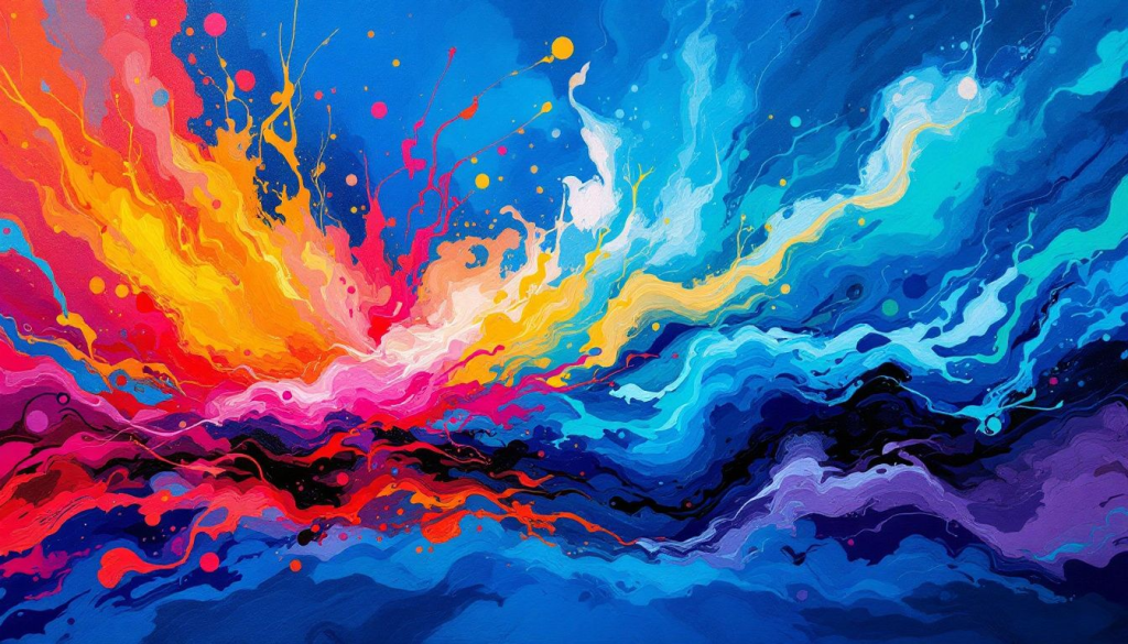
Colors have a profound impact on how we feel, think, and act. From sparking joy to signaling danger, colors influence everything from our daily decisions to the way we perceive brands. In this guide, we’re diving deep into the psychology of color—breaking down what each hue symbolizes, how colors are interpreted across cultures, and how you can use color theory to design with purpose.
Whether you’re building a brand, designing a product, or just picking a palette for your next project, understanding the meaning behind colors is your creative superpower. Let’s decode the emotional language of color—one hue at a time.
Colors Meaning: Key Takeaways
- Colors have rich historical significance and cultural interpretations that vary widely, impacting modern design practices and color choices.
- Understanding color psychology is essential for designers, as different colors evoke specific emotions and can influence users’ experiences and behaviors.
- Effective use of color combinations and awareness of cultural variations are crucial for creating inclusive and impactful designs that communicate appropriate messages.
Historical Significance of Colors

Colors have carried symbolic meaning across centuries, and this history still shapes modern interpretations. This section will take you through how color symbolism evolved and how different cultures assign meaning to the same colors.
In ancient Rome, red signified war and passion, while blue was used in religious paintings to denote divinity. Over time, these meanings have evolved—blue now represents calm, reliability, and professionalism, especially in digital and corporate environments.
White, which denotes purity in Western culture, is used in many Asian cultures to symbolize mourning. These examples show how important it is to understand the cultural and historical context behind color use in branding and design.
Bonus Tip: When creating global branding, always research color meanings for your target region to avoid cultural missteps..
Understanding Color Psychology
Color psychology delves into how colors affect human emotions and behaviors. Bright, warm colors like red, orange, and yellow are often linked to increased energy and happiness. These hues can evoke emotions such as passion, enthusiasm, and energy, making them effective in grabbing attention and creating a lively atmosphere. Warm colors like gold and bronze also fall into this category, enhancing feelings of warmth and comfort.
On the other hand, cool colors such as blues and greens tend to create a soothing and calming atmosphere. These colors evoke feelings of relaxation, serenity, and tranquility. Cool colors, including purple, are typically used to create a peaceful and subdued environment. The strategic use of warm and cool colors can significantly impact the mood and emotional well-being of individuals, making color choices crucial in environments like homes and workplaces.
Understanding color psychology helps in creating designs that not only look appealing but also resonate emotionally with the audience. Selecting colors that evoke the intended emotional response can enhance communication, promote social openness, and positively affect mental health and well-being.
Key Colors Meaning Every Designer Should Know

Colors play a pivotal role in design, serving as a visual language that conveys emotions, values, and messages. The three primary colors—red, yellow, and blue—serve as the foundation for creating all other hues. Each of these primary colors carries its own set of meanings and psychological effects that are crucial for designers to understand.
Primary colors are the building blocks of the color wheel, and their significance extends beyond mere aesthetics. Red, for instance, is known as a power color, symbolizing passion, danger, and urgency. It’s a primary color that demands attention and evokes strong emotions. Blue, on the other hand, is often associated with trust, calm, and intelligence, making it a staple in corporate branding. Yellow is an energetic color, symbolizing joy, youthfulness, and optimism.
Knowing the significance of these key colors enables designers to craft more effective and impactful designs. By strategically using these colors, designers can evoke specific emotions, convey particular messages, and enhance the overall user experience. In the following sections, we will delve deeper into the meanings of red, blue, and yellow, exploring their psychological effects and practical applications in design.
Red: The Power Color
Red is a color that commands attention and evokes strong emotions. It symbolizes passion, danger, and urgency, making it one of the most powerful colors in the spectrum. The psychological effects of red include raising blood pressure and increasing respiration rates, which is why it is often used to create a sense of urgency or excitement.
In design, red is frequently used to illuminate, call attention, and create a sense of urgency. It’s a color that can make a statement, whether it’s in a logo, advertisement, or website design. Common associations with red include love, anger, danger, and importance, making it a versatile yet intense color that can evoke a wide range of emotions.
Recognizing the impact of red enables designers to strategically capture attention and convey strong messages. Whether it’s a bold red logo or red branding or a call-to-action button, red can significantly impact the effectiveness of a design.
Blue: The Responsible Color
Blue is often seen as a responsible and trustworthy color, symbolizing calm, trust, and intelligence. In color psychology, blue is linked with feelings of calmness and responsibility, making it a popular choice for corporate branding. Industries such as tech, finance, and healthcare frequently use blue due to its connotations of trust and reliability.
Different shades of blue can convey different messages. Dark blues are perceived as strong and reliable, making them excellent for corporate use. Light blues, on the other hand, can evoke a sense of calm and tranquility, enhancing the soothing effect of the color. Bright blues, in particular, symbolize trust, reliability, and stability, making it appealing in business contexts.
The versatility of blue allows designers to use it in various contexts to convey messages of trust, calm, and intelligence. Whether it’s a deep navy blue for a corporate logo or a light blue for a calming website background, blue can enhance the overall effectiveness of a design.
Yellow: The Energetic Color
Yellow is a color that radiates energy and positivity. In Western cultures, the color yellow is a symbol of joy. It also represents youthfulness and fun. It represents optimism, cheerfulness, happiness, warmth, and energy. In color theory, yellow is commonly associated with happiness, caution, and optimism, reflecting its dual nature.
Yellow can evoke feelings of happiness, sunshine, hope, and even danger. Its dual meanings can be seen in its warm, positive attributes contrasted with warnings and caution signs. Practical considerations when using yellow in design include potential negative perceptions, as some shades can look cheap. However, bright or neon yellow is attention-grabbing and can enhance visibility, making it effective in branding and eco-friendly designs.
Knowing the vibrant nature of yellow helps designers craft cheerful and optimistic designs. Whether it’s a bright yellow logo or a pale yellow background, yellow can infuse a design with positivity and energy.
Exploring Secondary Colors

Secondary colors are created by mixing primary colors and play a crucial role in design. These colors provide a balance between the boldness of primary colors and the softer tones of tertiary colors. Grasping the role of secondary color is crucial for balanced and harmonious designs.
Secondary colors include green, orange, and purple. Each of these colors carries its own unique set of meanings and psychological effects, making them valuable tools in a designer’s color palette. For instance, green symbolizes nature and growth, orange represents creativity and enthusiasm, and purple signifies luxury and spirituality.
Exploring the meanings and applications of secondary colors allows designers to enrich their work with a broader palette. In the following sections, we will delve deeper into the meanings and uses of green, orange, and purple.
Green: The Natural World
Green is a color green that is deeply connected to nature and growth. It symbolizes harmony, wealth, and freshness, making it a versatile color in design. Many brands utilize green to promote eco-friendliness and signal sustainable or organic product offerings.
Bright green hues can evoke feelings of energy and vitality, while darker greens are linked to stability and wealth. Historically, green has represented fresh vegetation but was also associated with poison and death in the 18th century. These contrasting meanings highlight the complexity and versatility of green in design.
Recognizing green’s natural and harmonious associations helps designers effectively use it in eco-friendly branding and designs that convey growth and stability. Whether it’s a vibrant green logo or a dark green background, green can enhance the natural and fresh appeal of a design.
Orange: The Vibrant Shade
Orange is a vibrant and energetic color that signifies creativity, enthusiasm, and warmth. It is commonly used in advertising to draw attention and promote enthusiasm, making it an effective tool for capturing audience interest. Unlike red, which often conveys urgency, orange is seen as safer and more approachable, creating a sense of friendliness and invitation.
In design, orange is frequently used to create a welcoming and lively atmosphere. It can be particularly effective in designs that aim to inspire creativity and adventure. Orange is also perceived as a friendly color, making it suitable for brands that want to appear approachable and engaging.
The practical applications of orange in design are vast, from highlighting important elements to creating a warm and inviting ambiance. By understanding the vibrant and enthusiastic nature of orange, designers can use it to enhance the dynamism and appeal of their designs.
Purple Hues: The Luxurious Touch
Purple is a color often associated with luxury, royalty, and spirituality. Historically, the rarity and expense of purple dyes made this color synonymous with wealth and royal status. In contemporary design, purple continues to communicate decadence and opulence, especially when used in darker shades.
Purple branding can evoke feelings of spirituality and introspection, making it a powerful color for designs that aim to convey depth and sophistication. Combining purple with gold can elevate its luxurious feel, while lighter shades can be used to create a playful and whimsical touch.
Purple’s rich and sophisticated nature makes it a unique color that stands out in a maximalist way, differing from the stark minimalism of black and white. Recognizing purple’s luxurious and spiritual associations helps designers use this particular color effectively in high-end and imaginative creations.
Whether it’s a dark purple accent in a luxury brand or a light purple element in a playful design, purple can add a touch of sophistication and depth.
Neutral Colors in Design
Neutral colors are essential in graphic design, often serving as backdrops that allow brighter colors to stand out. These colors include black, white, gray, and various shades of beige and ivory. Neutral colors help create sophisticated layouts by combining with brighter colors to enhance the overall design.
Neutral colors provide a versatile palette that can be used to create different moods and atmospheres. For instance, ivory is warmer than white and can add elegance and calm when paired with other colors. In many cultures, white symbolizes purity and innocence, whereas in some Asian cultures, it represents death and mourning.
Recognizing the role of neutral colors aids designers in crafting balanced and harmonious compositions. In the following subsections, we will explore the meanings and applications of black, white, and gray in design.
Black: Elegance and Mystery
Black is a color that symbolizes power, elegance, and formality. In Western cultures, black is associated with sophistication, elegance, and exclusivity, often employed in high-end fashion and luxury branding. Minimalist design frequently uses black to provide a sleek backdrop that emphasizes simplicity and sophistication.
As a neutral color, black can either contrast or complement lighter shades, enhancing the overall impact of designs. Black’s versatility makes it a staple in various design contexts, from high-end fashion to modern minimalist designs.
Recognizing the elegance and mystery of black helps designers create powerful and sophisticated designs. Whether it’s a sleek black background or a bold black element, black can add a touch of class and depth to any design.
White: Purity and Simplicity
White represents purity and innocence. It also signifies simplicity, peace, and cleanliness. In design, white represents minimalism and freshness, often used to create a clean and uncluttered aesthetic.
In many Eastern cultures, white is traditionally worn during funerals, contrasting its association with purity in Western contexts. This cultural variation highlights the importance of understanding the different meanings of colors in various cultural contexts. White creates a minimalist aesthetic and serves as a neutral backdrop that conveys cleanliness and simplicity.
Knowing the purity and simplicity of white helps designers create clean and minimalistic designs. Whether it’s a white background or a white accent, white can enhance the clarity and freshness of any design.
Gray Backgrounds: Professionalism and Balance
Gray is a color that symbolizes professionalism, formality, and balance. It is commonly utilized in corporate designs to project a sense of formality and professionalism. Charcoal gray, in particular, is associated with independence, confidence, stability, reliability, practicality, and professionalism.
Dark grays can be used effectively in design as a classy replacement for black, providing a sophisticated and balanced look. Gray’s versatility makes it a valuable color in various design contexts, from corporate branding to modern minimalist designs.
Recognizing the professionalism and balance of gray helps designers create formal and sophisticated designs. Whether it’s a gray background or a gray accent, gray can add a touch of professionalism and balance to any design.
The Impact of Color Combinations

Effective color combinations can enhance user experience by ensuring visual harmony and communication. Choosing the right color pairs is crucial for creating impactful designs that engage users and convey the intended message.
Ensuring accessibility in color palettes is vital for readability and user engagement. Tools like Webflow’s vision preview mode, Figma’s Color Blind plug-in, and Colorblindly can help designers assess color accessibility and create inclusive designs. Cultural context also significantly influences how colors are perceived in branding and marketing, affecting consumer behavior and preferences.
Recognizing the impact of color combinations helps designers craft harmonious and effective designs that resonate with their audience. Considering accessibility and cultural context allows designers to enhance user experience and create visually appealing, inclusive designs.
Using Color to Evoke Specific Emotions
Colors play a significant role in evoking emotions and can be strategically used to influence feelings. Specific colors like azure are known to evoke feelings of serenity, peacefulness, and calmness. Understanding the emotional impact of colors helps in creating more effective designs and messages.
Warm colors like red and orange can enhance the emotional experience of the audience by evoking feelings of passion and enthusiasm, while cool colors like blue and green can create a calming and soothing atmosphere. Additionally, the use of a warm color can further amplify these effects.
Strategic use of color to evoke specific emotions helps designers create emotionally resonant designs. Whether it’s a warm and energetic design or a cool and calming one, understanding the emotional impact of colors can enhance the effectiveness of any design.
Cultural Variations in Color Symbolism
Color symbolism varies significantly across different cultures and time periods. For instance, in Chinese culture, red symbolizes good fortune and is prominently used in celebrations and weddings. In contrast, the color red in South Africa is associated with mourning, bloodshed, and sacrifice.
Colors can symbolize contrasting concepts in different cultures. For example, white symbolizes purity and innocence in many Western cultures, while in some Asian cultures, it represents death and mourning. Yellow symbolizes happiness in some cultures, while in others, it may denote cowardice or mourning.
Recognizing cultural variations is crucial for effective global branding to avoid misinterpretations and ensure appropriate messaging. Awareness of how different cultures interpret colors helps designers create culturally sensitive designs that resonate globally.
Practical Tips for Applying Color Theory
Using the color wheel aids designers in identifying harmonious, contrasting, or dynamic color combinations. The color wheel is a crucial tool for understanding how different colors interact and complement each other in design.
When choosing a color for a project, consider the message you want to convey and the impression on your target audience. Testing color palettes in various contexts helps confirm their effectiveness across different mediums. Bright colors can also help combat Seasonal Affective Disorder by uplifting mood during darker months.
Surrounding oneself with positive colors can foster better social interactions and relationships. Applying color theory helps designers create effective, impactful designs that resonate with their audience and enhance user experience.
Summary
In summary, understanding the meanings and psychological effects of colors is crucial for creating effective and impactful designs. From the historical significance of colors to modern-day applications in design, color psychology provides valuable insights into how colors influence emotions and behavior.
By exploring the meanings of primary and secondary colors, the role of neutral colors, and the impact of color combinations, designers can create harmonious and engaging designs that resonate with their audience. Understanding cultural variations in color symbolism ensures that designs are culturally sensitive and appropriate for a global audience.
The practical tips for applying color theory provide designers with the tools and knowledge to create effective and inclusive designs. By harnessing the power of colors, designers can enhance their designs and communicate more effectively with their audience.
Frequently Asked Questions
Understanding color psychology is crucial for designers as it enables them to evoke specific emotional responses and enhance communication with their audience. Thoughtful color choices can significantly impact the effectiveness of a design and its ability to connect with people.
Cultural variations in color symbolism significantly impact design by shaping perceptions and interpretations of colors across different cultures. Acknowledging these differences is crucial for effective communication and branding strategies, ensuring that designs resonate appropriately with diverse audiences.
The primary colors are red, yellow, and blue, serving as the essential building blocks for all other colors in design. Understanding their unique meanings and psychological effects is vital for effective visual communication and influence in design.
Designers can enhance their designs by using harmonious color combinations that create visual appeal and effectively communicate the intended message. Utilizing tools like the color wheel helps in identifying these effective color pairs.
Applying color theory effectively in design involves using the color wheel for harmonious combinations and aligning your color choices with the intended message for your audience. Testing your color palettes in different contexts will also ensure their effectiveness.